This savvy couple from Sparta NJ ditches the typical Floridian décor in favour of a home alive with colour!
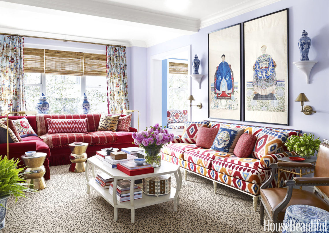
Inspired by a photo by designer and decorator Mark D Sikes, (shown above) Sharon and Kirk created a spacious chinoiserie influenced home that gives them an open layout with an easy room-to-room flow ideal for entertaining family and friends.
Last season while at the Farmers Market I met a lovely lady named Sharon. We struck up a conversation and have since become Savvy Snowbird friends. We easily chatted about decorating, where to get good deals on furniture, fabric and bringing everything together with the right inspiration and colour palette.
Sharon had taken a course called Specify Colour with Confidence in 2016 she went to the actual physical course in Tampa (as opposed to online). The course is by designer Maria Killam and she has a Toronto show coming up in May. I was contemplating going but by the time I made up my mind, it was sold out!!! D***!!….maybe next year…actually for sure next year. Anyways, with her new found knowledge and obvious confidence, Sharon and Kirk made the most of every inch of their home and created their own paradise.
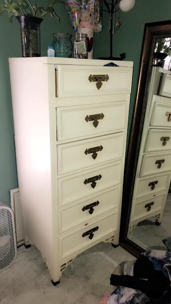
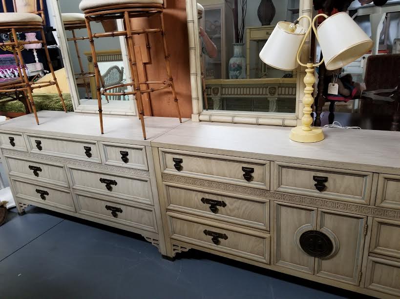
Sharon was gearing up to do a really big renovation. A house doesn’t become a home until someone cares and is patient enough to make it so. Sharon and hubby Kirk had a clear vision of what they wanted. She collected pieces and had them neatly stored in her garage just waiting to be upcycled. She invited me over to show me her great finds that she got from Bob’s Beach Chic Treasure in Bonita Springs (you can follow him under that name on IG) and Possibilities by Jan in Naples. I have to be honest….seeing all that she collected and hearing what she had in mind for it….wow I was impressed…. this lady had some savvy décor ideas!! This was definitely not going to be your typical Florida home.
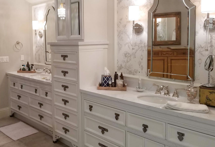
I don’t even know how she knew these pieces would work all together as one unit in her bathroom! There is plenty of storage for her and Kirk. I absolutely love the black and white wallpaper choice. After painting out the cabinets Sharon used Annie Sloan’s Gilding Wax in dark silver for the hardware. It might have been a bit more work for her than having the hardware changed…but the patina adds to the overall effect.
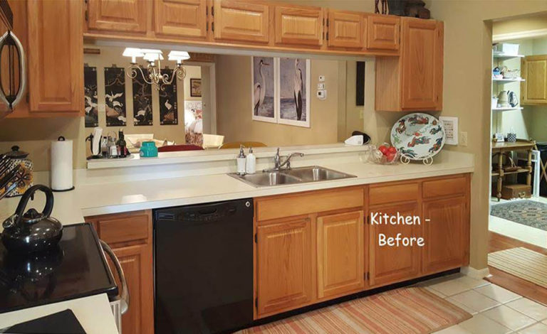
The kitchen was unquestionably outdated…but at least it was clean and functional until she was ready to do the renovation. Who thought of these kitchen pass-throughs? LOL…we had one in this house too. The bank of upper cabinets is ridiculous!
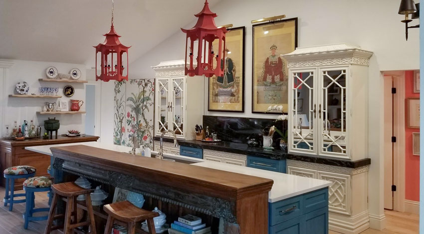
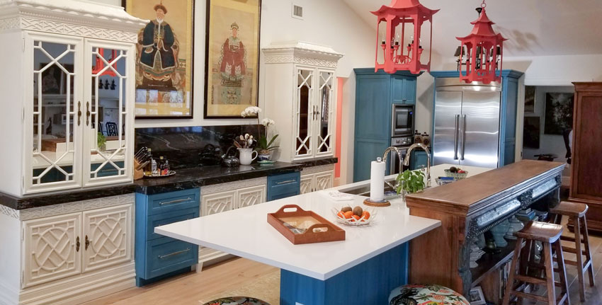
Doesn’t even look like the same space, does it? The large piece on the front of the counter was from Possibilities by Jan…a consigner in Naples. It was Kirk that had the vision for this piece. “We wanted a separation of work space and the space guests would inevitably use to drop purses and bags”.
Kirk also researched the white Chinese cabinet pieces that is in the background. “We didn’t want the open concept space to look like a kitchen”. A blogger that Sharon follows appropriately called it the unkitchen!
I love that Sharon (or maybe it was Kirks idea LOL) broke up the countertop colours. The silks hanging above the stove were bought at an Antiques Mall, called Black Rock Gallery in Bridgeport, CT. When Sharon saw the light fixtures she hesitated buying them as they were not the right colour…but being as handy and creative as she is…she knew a fresh coat of paint would work magic on them and she was right!!
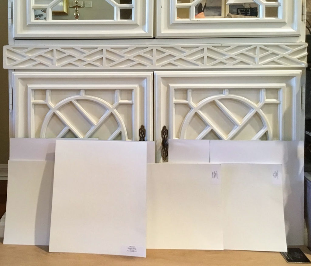
You can see where Maria Killams’s course came in handy! I wonder…just how many shades of white there actually are…mind-boggling.
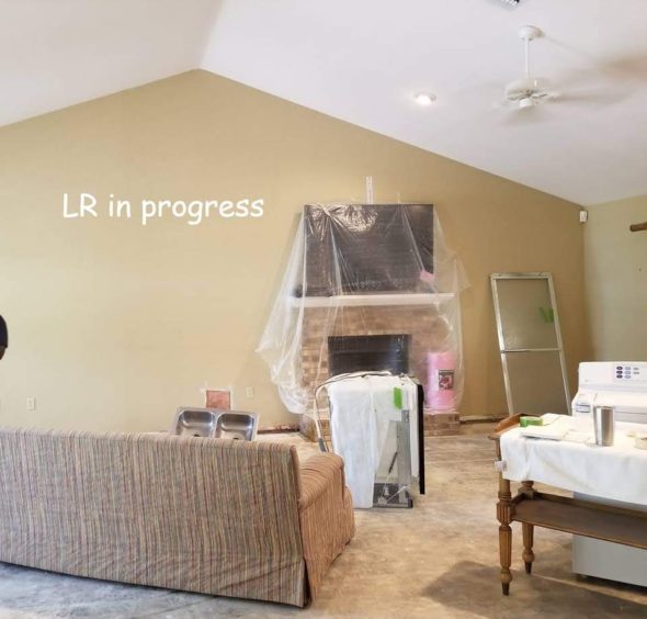
This is the beginning of the living room makeover…a teeny weeny fireplace on a rather large and boring wall…wouldn’t you agree?
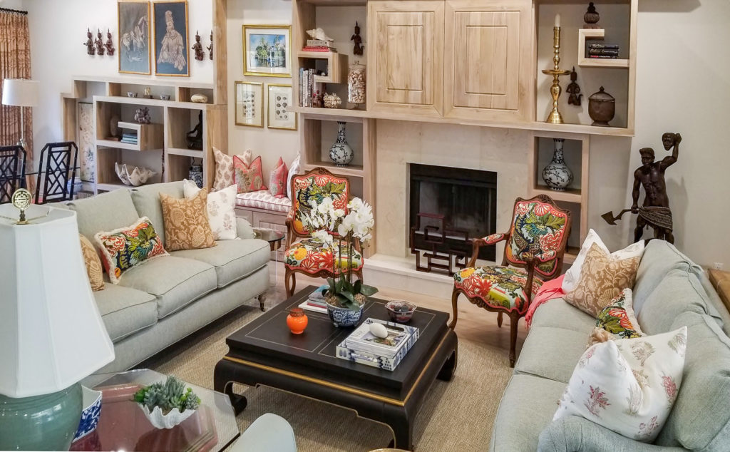
I purposely made this photo a bit bigger than the others so that you can really stop to look around!! Is it even the same room? You betcha!!! Where do I start? The coffee table (again from Bob’s) was a nondescript wood coloured table. It was painted out black with some gold highlights. Sharon had a small shelf that had variously sized shelves…it was about 3′ X 3’…it gave her the inspiration for the entire wall unit that was created by the artist by Jackie Morelisse of BouTeak in Naples.
I love the old mixed in with the new incorporating wonderful antiques and accessories with character.
“Many of the items that are on the wall unit are special items to Kirk, as his parents and he travelled and lived overseas”.
Sharon had seen the fabric that is on the living room chairs in a magazine. When she walked into the fabric store and saw it there she knew she had to purchase some and use it somewhere in her home. I love, love, love the impact of colour.
Often when she sees a fabric that she likes Sharon buys it right there and then and figures it all out later. It always seems to work out for her too. She had a bolt of fabric that she loved and was able to finally use as the dining room drapes. She admittedly had a hard time finding fabric to compliment it. Very smartly, she reached out to the company that she bought it from and asked them for their suggestions. She loved what they chose and that is what she herself sewed her cushions on the couch from.
Sharon’s home feels warm and cosy when it’s just her and her husband……..and yet there is plenty of space to spread out if there is a crowd. I picture visiting friends enjoying the space with a sense of belonging as though they are family.
When you walk into Sharon’s home you literally stop in your tracks and try to take it all in. There are interesting textures and beautiful pieces everywhere you look.
Her reno didn’t stop with the living room and ‘unkitchen’. Her bedrooms were updated, doorways were moved in the hallway their laundry room is beautiful too. I chatted with Sharon the other day and asked her what she was up to….”oh…just painting my lanai”!!!!
I feel that Sharon and Kirk really appreciate the simple beauty in items that they find when strolling through flea markets and antique stores. They both clearly love pieces that have history and yet fit so well in their own authentic home. Thank you so much, Sharon for allowing me to share your gorgeous home with all of us. I hope you are as proud of yourself as I am of you. Xo
PS…I didn’t realize it but my bathroom inspiration picture is from Maria Keller’s blog. It was one of my follower’s that pointed it out to me the other day. What a coincidence that I would be mentioning her and her course in my blog today.





10 Comments
Sharon Shearer
April 5, 2019 at 3:17 AMMarion,
Thank you so much for featuring my home in your blog. What an honor. I know I talked your ear off with all the details and you heard everything! You have a great blog that is fun to read and makes me laugh out loud with your great easy spirit. Keep it going.
Marion
April 5, 2019 at 8:48 PMAre you kidding me? It was my absolute pleasure!!! It was fun to do someone else’s home. Everyone has such different tastes and ideas…it is fun to share them with others. I already have the next home that I am going to feature…completely different from yours…but equally as interesting and beautiful. Full of colour too…and that is all I am going to say about that!! LOL xo
Mary Lynn
April 5, 2019 at 2:32 PMEverything is beautiful, love the living room. I am such a minimalist myself but i appreciate all the decor, obviously a very interesting couple. Thanks for sharing. ML
Marion
April 5, 2019 at 8:46 PMoh my gosh ML…it IS all so beautiful. Now I can NEVER have her over to my house!!! LOL….thanks for popping in as always ML!! xo
Andree Jean
April 5, 2019 at 5:45 PMMarion i enjoy so much reading your blog.
Sharon and her husband surely have a eye for unique decor and ideal, love it! Congratulation!
So much fun to see the before and after picture. They did a amazing job??
Thank you Marion for sharing there story❤️
Marion
April 5, 2019 at 8:45 PMSo sweet Andree. Sharon really did an awesome job…especially when it was all her and her husband and they are not professionals. Not easy to do….it takes a lot of confidence!! Glad you enjoyed it.
Mary Ferguson - Allan
April 5, 2019 at 8:07 PMWow very colourful and beautifully put together.
Marion
April 5, 2019 at 8:44 PMI agree. She did a beautiful job…
Sue
April 8, 2019 at 5:17 PMThe before and after photos are unbelievable!! I love the way all of the vibrant prints and colors come together. They have done a wonderful job and I certainly can appreciate the many hours that must have gone into this project.
Marion
April 8, 2019 at 8:23 PMFor sure Sue. Sharon and Kirk did an amazing job in making their vision become a reality!! Thanks for popping in and leaving a comment. xo